Ghien-Vietnamese Restaurant Chain
About the Brand
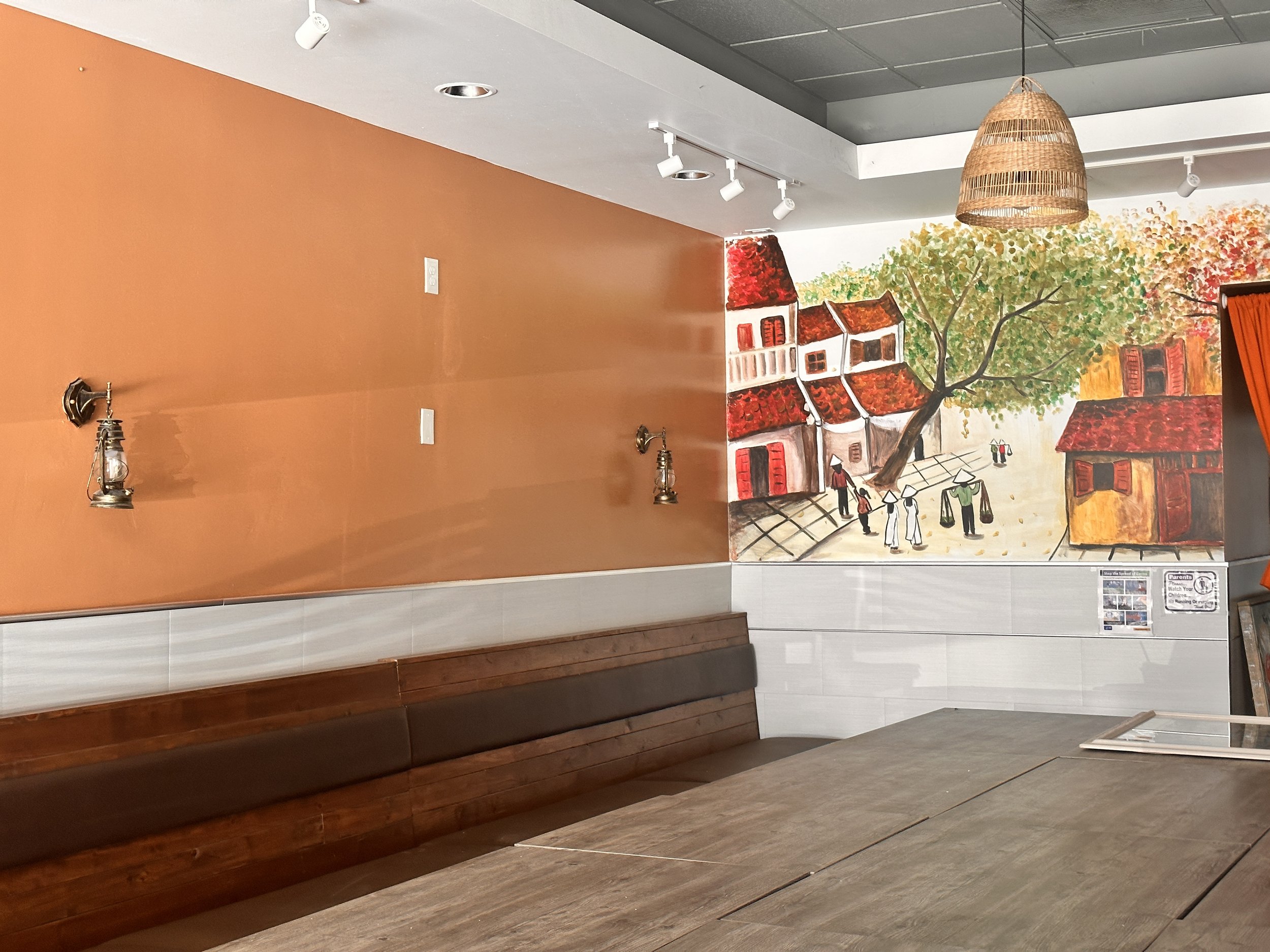
Ghien Bun Bo stands as a beacon of traditional Vietnamese cuisine in the heart of Westminster, California, United States.
Having immigrated from Vietnam over five decades ago, Diem Phan and Trang Ho embarked on a culinary journey, exploring numerous Vietnamese restaurants in the area to savor the flavors of their homeland. Despite their extensive exploration, they sensed a void—a missing essence and soul in the dishes offered. Motivated by a desire to fill this void and share their authentic culinary vision, Diem Phan and Trang Ho courageously opened Ghien Mi Go in 2020, shortly after the challenges posed by the Covid-19 pandemic.
This restaurant represents not merely a dining establishment but a heartfelt endeavor to deliver food that encapsulates their beliefs and impeccably presents the richness of Vietnamese culture.
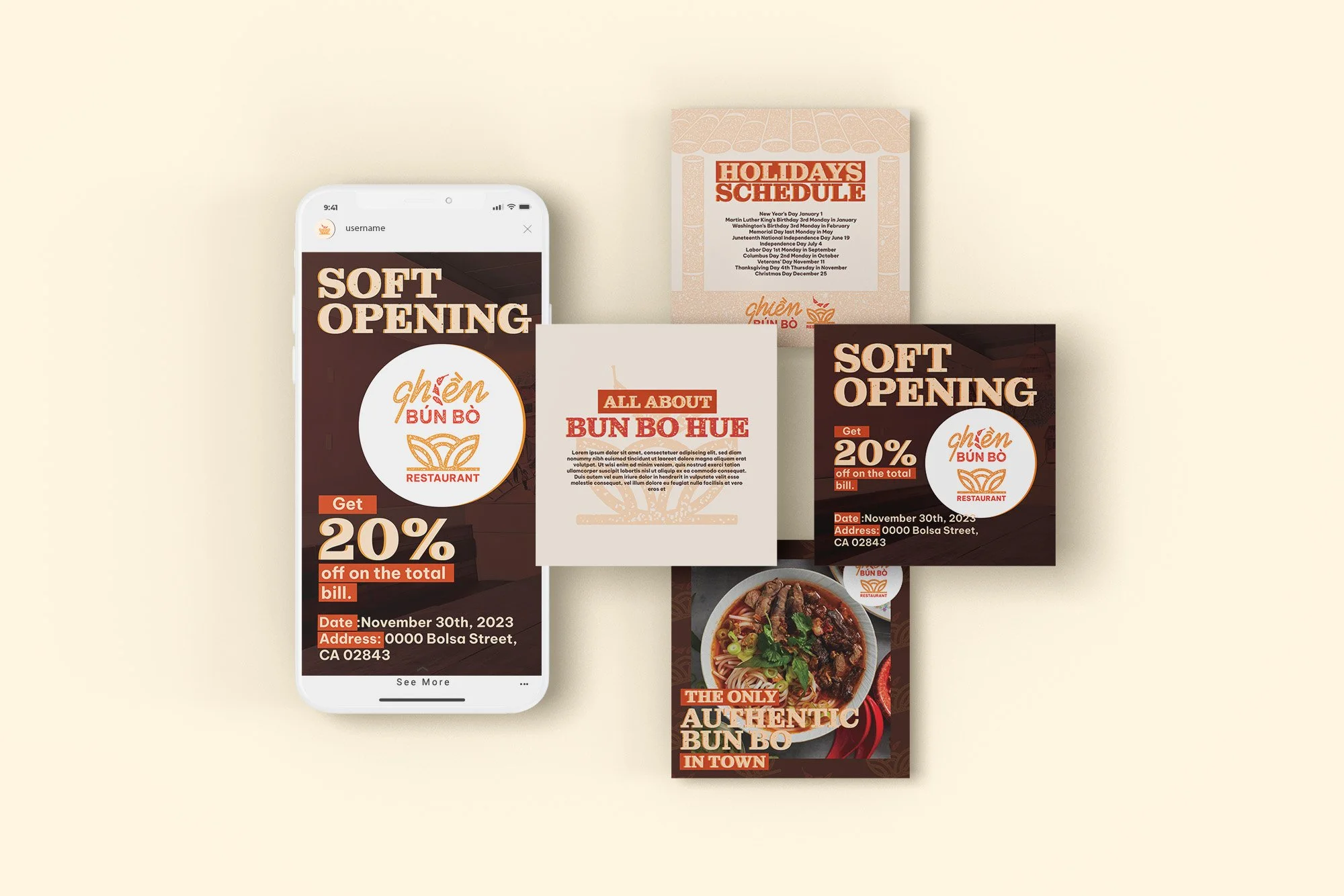
In 2024, Diem Phan and Trang Ho opened their second restaurant, Ghien Bun Bo, focusing on showcasing one of their standout dishes. Simultaneously, they are exploring design solutions to accommodate the expansion of their restaurant chain. This move underscores their commitment to culinary excellence and a thoughtful dining experience.
November 2023-February 2024
Clients
Ghien-Restaurants & Food To Go
Sector
Food & Drink
Discipline
Brand Strategy, Visual Development, Illustration, Social Media Design
Project Team
Alice Le-Creative Director
Tung Truong-Graphic Designer
Before
Pros:
Colorful and playful in the word “Ghien Mi Go)
Deltas:
Missing a hierarchy, especially in the logo itself and title treatment
Vertical Variation
Main Logo for Ghien
About the Projects
Goals
Revamp a visual system that seamlessly accommodates multiple future restaurants while concurrently establishing a parent logo that encapsulates the entire brand.
Challenges
Situated in the competitive landscape of Westminster, an area densely populated with Vietnamese restaurants vying for attention, the task at hand is to craft a visual system that distinctly stands out.
Furthermore, the logo preserves characteristics and symbols from its predecessor, ensuring a sense of continuity and familiarity for their existing customer base.

Brand Attributes
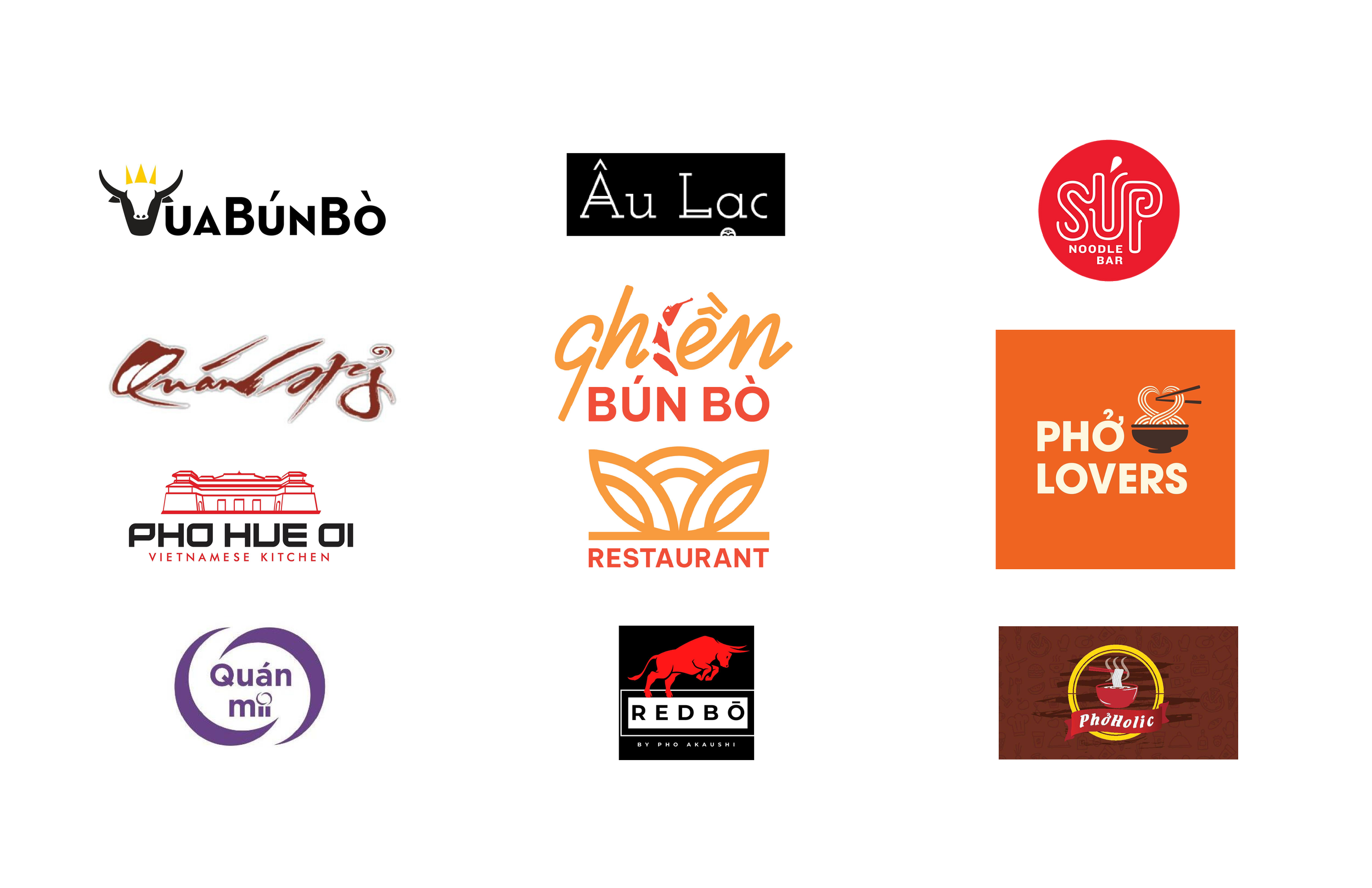
Competitors
Logo Design
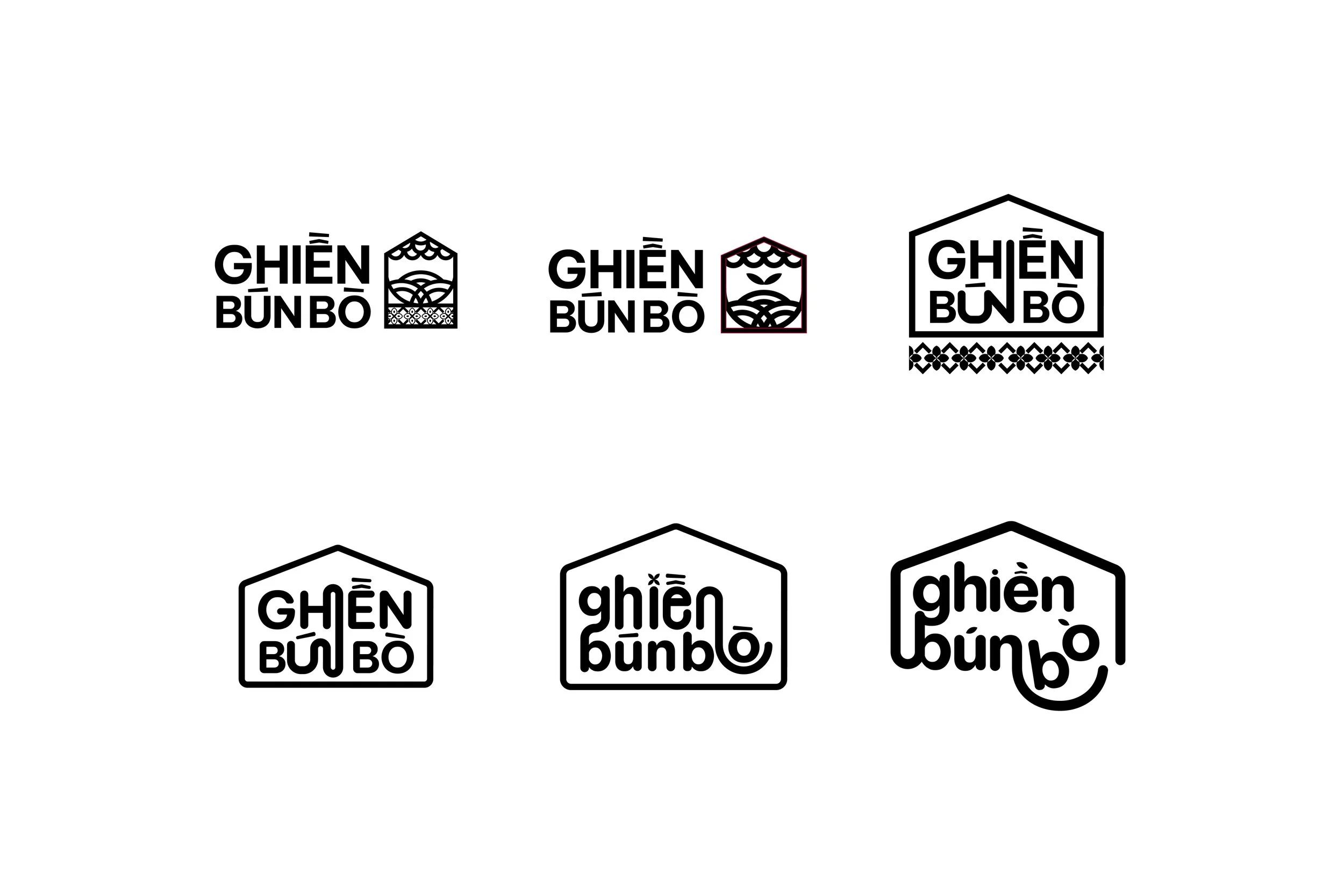
Exploration
After
The new logo maintains the bowl shape and hierarchy of the original design, seamlessly blending in a lotus image. This combination symbolically represents the food's origin, adding cultural significance to the brand identity.
In response to the client's suggestion, the incorporation of chillies into the visual elements is proposed, adding a personal touch and creating a distinctive feature that aligns with their preferences. This addition will not only enhance the visual appeal but also infuse a unique and memorable aspect, making the brand stand out in the competitive Westminster restaurant scene.
Horizontal Variation
Tagline Application

Full Logo System